Sarah Sarchin writes: Jenny Gagalka’s works are pop-culture fever dreams pressed through the vernacular of painting. They are image and gesture as one; they are color as form. Gagalka’s upcoming presentation at Good Weather Gallery in Chicago is a homecoming of sorts – a reunion with gallery director Haynes Riley who curated her first solo show over 10 years ago. In this conversation, me and Jenny talked at Jenny’s studio in downtown Los Angeles on April 25, 2024 over some pastries from Doubting Thomas Cafe. Minimally edited by Jonathan Pfeffer.
SS: Let’s talk about the subjects of the paintings you have in this show.
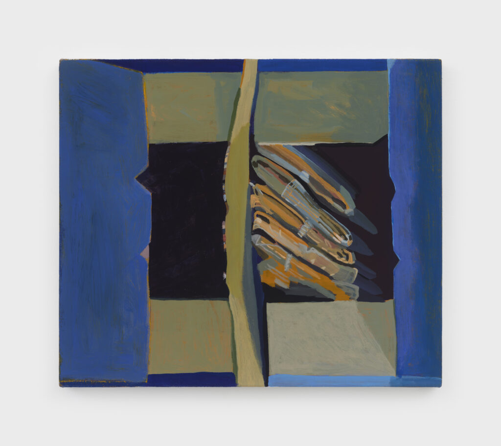
JG: These paintings are on the topic of hats. My last body of work was on the topic of a box and before that was on the topic of a bag. Here we are with another three-letter word. They’re all observational paintings where I set up still lifes of an object that isn’t really important. Of course, then it becomes really important.
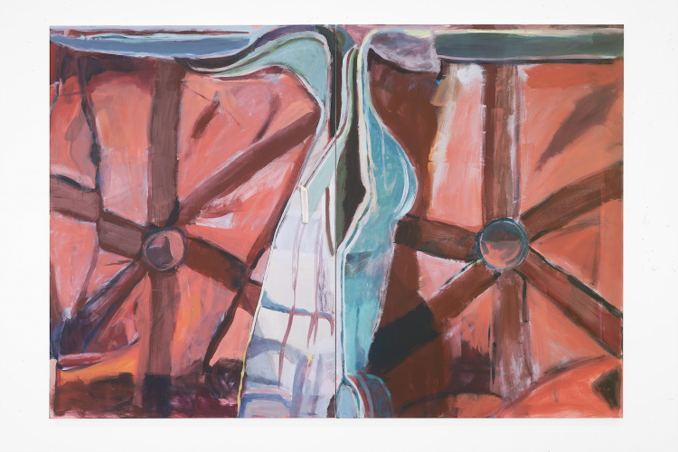
It can be any object, but it can’t be every object. Throughout the years – subconsciously I suppose – I select these blunt objects of mass crass consumption. They’re highly circulated. They’re containers. They’re objects that contain shadows. In this body of work, I began painting these two Adidas hats. Then, later in the process, I added some more hats because there are many paintings going on at the same time. So I need more hats, not just the two that were just lying around here – one white Adidas hat and one black Adidas hat. I added a few LA Dodgers hats into the repertoire and I also included a pair of shoes.
SS: Were these hats that you initially wore or hats that came into the studio some other way?
JG: These are hats I wore. I wore the black hat to the point where it’s no longer black; it’s practically green because it’s been bleached by the sun. I was originally going to have two simultaneous solo exhibitions – one on the fourth-floor gallery space and one on the ground floor. As an initial “let’s just get to work” thought, I came up with a seemingly dumb idea: I was going to have drawings upstairs like the headspace of these hats then have paintings of shoes downstairs. Feet are on the bottom, the head is up there, and somewhere in between is the body.
We changed the plans for the exhibitions and I’m going to have the second part of the exhibition of drawings in Good Weather’s other space in Arkansas at a later date. So, for this exhibition on the ground floor in Chicago, I’ll have the shoe paintings installed in the office and the backroom, and the paintings of the tops and insides of hats in the main gallery space. So, that was the initial point of departure of this body of work and I improvised from there.
SS: All of these paintings are a sort of extreme close-up or crop; we can’t see the whole object. You’re not being obvious about what these things are when we first encounter them. But seeing several shoe paintings together – the hats as well – if you can’t read one of them, then you have the context of all their neighbors. Can you talk about this kind of choice of zooming in?
JG: Yeah, that started from the yellow bag drawings. Originally, the whole object was depicted on a tabletop or the floor, but the environment is just the studio, which I don’t find that interesting. So, in the drawings I started to get closer and closer to the object until the straps began to form their own internal boundaries of the page.
SS: Oh, so working from observation, part of the reason you zoom in on the object is to crop out the arbitrary background of the studio, but also to make the object fill the canvas?
JG: Yeah when you start to look at something for so long, you fall into it, like a trance. The composition in these paintings takes me a long time to figure out. You see the same composition repeating. I’m faced with the problem of how to fit a round thing into a rectangle. It’s a very detailed act of looking – not in a perverse way, maybe vulgar, but certainly erotic a little bit. My friend and excellent artist Mona Welch said the paintings had both an obsessive-compulsive experience and a sense of agoraphobia. She said, “Every part of the surface must be touched.”
SS: When she says “touch,” did you interpret that to mean with the paintbrush?
JG: Yes, physically with the brush. But also the way the paintings pack too much material into a very tight container and overflow at the seams.
SS: That’s interesting. There’s a nice correlation here between physical touch – or the touch of the paintbrush – and the touch of the eyeballs. And there’s something intimate about zooming in on these objects that have small cavities, like the concave dome for your head in a hat, or the hole in the shoe that your foot goes in.
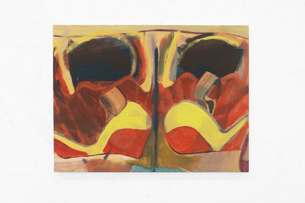
JG: The hat paintings suggest a head first and the shoe paintings are feet first. In baseball, you can slide into a base either of those ways. Headfirst is more dangerous but faster – funny how it’s also the plan in the birthing process. I try not to deviate from observation; I don’t take off and start to use my imagination, whatever that is. Of course I do, but I try to stay true to the object since observation is key. It’s 50/50 looking at and looking away in observational painting – that back and forth. The smaller paintings of two hats stacked on top of each other started to become faces. I think of them as fanatical fans or lobotomies.
SS: Did you want to talk about anthropomorphizing?
JG: Well, for me, painting functions as a site of projection. The paintings are psychologically charged. When I leave the studio, I feel hyper-aroused but not in a sexual way. I don’t know if it’s because of the loud color or because I’ve been looking at something for so long and witnessing it shift into something else totally unexpected. Of course, our desire to anthropomorphize things is so that we can both relate to and overpower.
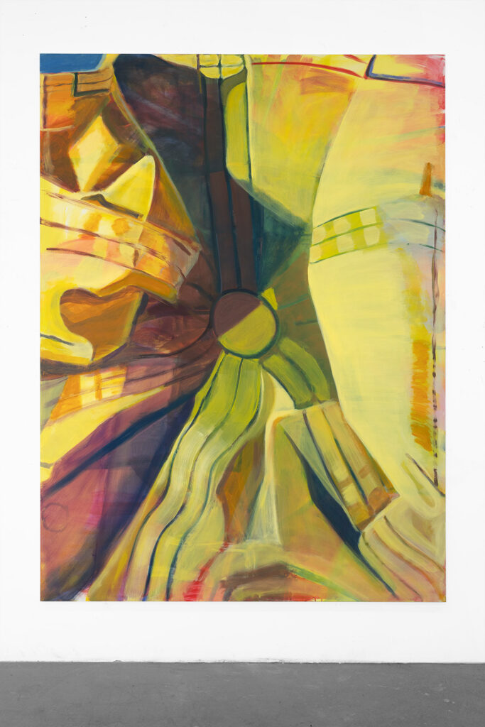
SS: These paintings feel completely anchored in observation to the armature of the hats or the shoes. The object is the establishing framework for the whole thing. But while you retain this feeling of fidelity from start to finish, you’re also able to wildly deviate. They are so inventive, certainly in terms of color and scale. Especially the larger paintings where there’s a huge shift from a hat that’s the size of your head to the size of a large painting.
To make it this big you’re squeezing all this additional detail out of the object. What you said before about the intense relationship that builds between you and the object when you look at it for so long – you are interrogating it for more and more and more information.
There’s something here that feels related to the project of Impressionism, or someone like Pierre Bonnard. It starts with some stuff on a table, but you have this ability to get all this additional juice out of it – or into it. That experience you’re describing of the pleasure of the studio – the pleasure of being in the studio and after leaving the studio – I wonder if that has to do with being able to produce something that wasn’t there in the hat but now exists in a very undeniable and concrete way in the painting of the hat.
JG: Yes. That is so rich. I see a correlation between these banal objects I paint and the Impressionist instantaneousness. A painter I looked at this month is Gustave Caillebotte. In his paintings there’s always something cropped, like outside of the image. Or people on a bridge with forced perspective or a table that you only see half of. He painted using a camera obscura. A lot of it’s about technology – it’s new technology. But what both Caillebotte and Bonnard have in common is a modernist tradition of an obsession with the everyday or the quotidian.
SS: Right, you’re always inheriting something with painting and adding your thing to the pile. In terms of the responsibility of observational painting, and the inheritance of historical approaches to still life, this work feels like it’s both on the hook and off the hook. I think it’s because you’re able to deviate so wildly in the presence of these objects. Do they deviate mostly in color?
JG: To be honest, I don’t even see the color as exaggerated when painting, but of course it is mega dialed up. Full chromatic spectrum. Use every color as though the assembly line has gone out of whack. But still always with the delightfully heavy baggage of painting history. I think about the fabric in a Titian painting here – very loose but in the looseness is somehow able to describe extreme detail. And I always have our professor Silke Otto-Knapp on the mind – painting as a stage where anything can happen. Motifs repeating, changing, progressing from one thing to the next.
SS: Right, a motif! There are all these different ways that the paintings deviate from being an object while still an object. Thinking about scale again, all the hat paintings are so much bigger than a hat. So, it’s wild to suddenly recognize that specific type of button that’s at the top of the baseball hat, or that double-stitched seam that makes the fabric ripple in this particular way, or how the seams join each other, and the flap at the back that’s like the, uh, tightener on the hat band. The details are so particular to a baseball hat.
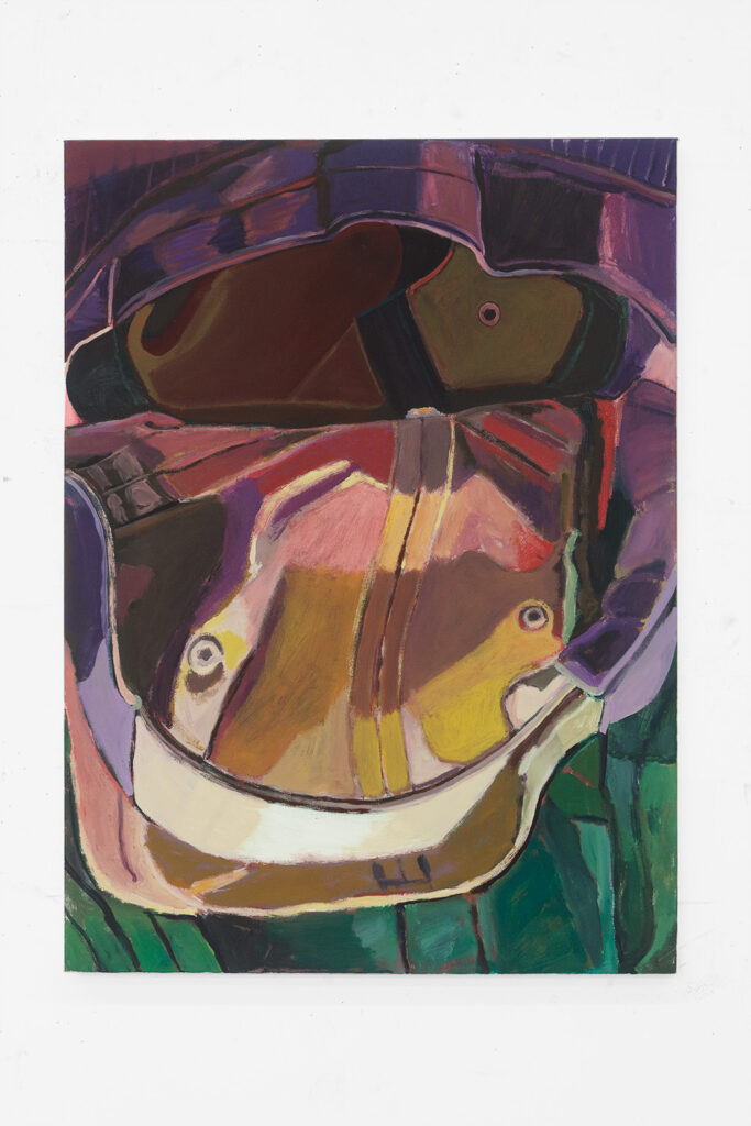
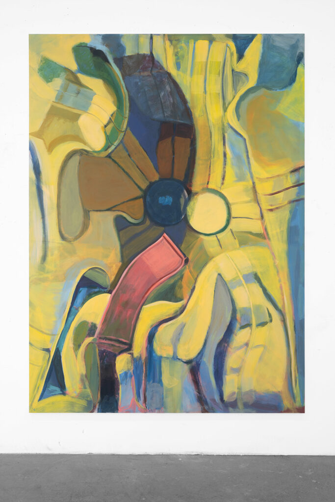
JG: Yeah, but then at another point it can become like a sun with the horizon lines converging. The larger paintings are a bird’s eye view of a hat. For some reason, I gave myself this constraint to paint the insides of hats only. But then the largest ones are the exterior of the hats, but kind of pushed in – concave, almost inside-out, like a double vision. The shadows become figures in the middle, then the painting becomes a wall that the Kool-Aid man, for example, could burst through. To see what’s behind, but is a shallow space within reach.
SS: Several of them become figurative or become faces or face-like. Is that intentional or something you draw out as you start to notice it? Or is it something that you see in the way you’re posing or manipulating the hats to be a subject before you even start painting?
JG: Definitely not from the get-go. I don’t want to paint these hats to look like figures or faces but the scale is bathroom mirror-ish – 22” x 30” – it’s kind of a long format. When I paint the little air holes in the hats, they become eyes or nipples. They’re arranged symmetrically. Who is it a portrait of? It’s like a funhouse mirror, where things become melted or distorted, frightening and hilarious. There are four of them like a nuclear family.
SS: The way you describe them being all the same size, and as a nuclear family, reminds me of the Charles Ray sculpture where a family is all the same size. It’s like the life-size mother and father with the giant baby and giant kid.
JG: Oh my gosh, I love that piece so much. You have just pieces of information and a certain perspective depending on where you are, and an illusion that becomes reality. It’s another projection-type thing. You were just telling me about [the TV show] Frasier. I never watched a full episode, but I remember when I was a kid I thought to myself, “When I’m 22, I’m going to live like Frasier and have a sunken living room overlooking an impressive view.” And today, I certainly don’t. Expectations!
SS: Do you think about these as a family?
JG: Working serially, that’s how it always ends up coming across eventually. It’s like, how much are these the same, how much are these different? Yeah, they’re kin. With these works, I started to be like, “Ooh, now they’re faces!” That’s such a juvenile thing to do to mark one’s territory and assert some sort of dominance. It’s embarrassing or shameful to anthropomorphize, but then I just succumb to following it.
SS: Does it not feel serious enough or what?
JG: Not serious enough, but does it always have to be about me? I guess with painting from observation is that you do the activity of painting it but you also have to look away. So, what happens in the in-between of the looking at and looking away? I think all painting and maybe all artwork is a self-portrait even though not necessarily in a diaristic kind of way. I was talking to you before about “Beauty and the Beast” and “The Brave Little Toaster.”
SS: You mentioned shame, which is something I also feel making paintings just because they are so much about the surface. There’s something that feels incredibly vulnerable and revealing about making something that is so immediately visibly available, and then having people look at it. But I also wonder how taste factors into your own ideas about what the work is doing or might be doing in the world.
There’s something so seductive, especially in this work that is so much about color as a subject – layering and modulating color in such a rich and sexy way. I could use the word “beautiful” about these surfaces, but there’s also the funhouse mirror quality with the way they become faces – or don’t. It can feel quite grotesque. That kind of duality leads us into “Beauty and the Beast”.
JG: And the roles that become reversed. This kind of this S&M-y imagery comes up in the work a lot, too. So you have these role reversals of trying to control the painting and then being controlled by the painting. I always feel like I’m not good at mixing colors. But also how thrilling, and creepy, or just fraught it is to get this sense of illusion, which then makes you feel you’re getting closer to something, but then you can lose it so quickly with the medium of paint.
There was a 1987 “Beauty and the Beast” TV series starring Ron Perlman and Linda Hamilton. We have so many different iterations of the story – Greek, Persian, French, the Grimm’s tale, Disney – and the story always changes.
In the show, Linda Hamilton is a highfalutin lawyer in New York. She gets kidnapped, assaulted, her face cut up, and left on the side of the road. Ron Pearlman, the beast named Vincent, comes out from the underground subway – the subterranean – then brings her down to his lair and nurses her back to health. Then she goes back to the real world above to avenge the bad guys. But really he’s actually her. He’s like an animus character – the beast within. They are the same person. Not to spoil it but she dies – she’s pregnant and delivers a baby, who is Vincent’s child, right before she dies.
SS: This version is so hilarious because he’s clearly intended to be this grotesque creature that society can’t handle and yet he’s very attractive and sexy.
JG: And what you were saying about taste, it speaks of appetite. I watched an interview with the director of the show who said they cast Ron Perlman and even though he’s not seen as a sex icon of an actor, all these women still fell in love with him. They made him look like a lion. “Felines are sexy; women like felines.” I don’t know who they polled, but this show was so successful, particularly with women who had been abused.
The Disney version is obviously a little different. The French version involves a father sacrificing his own daughter to appease the beast who threatens to eat the gifted daughter, but it turns out the beast is a really loving guy.
SS: So, it’s a question of personality or character, not judging by appearances?
JG: Which version?
SS: I suppose all of them. But in the television show, we’re supposed to understand him to be rejected by society for his appearance even though they’ve made him this strange, handsome animal man. What about all of the furniture that comes to life? Is that just the Disney version?
JG: It’s just the Disney one. Well, they’re all servants, right? If these items now live in the castle, wouldn’t that mean that servants previously lived in the castle?
SS: The servants have been transformed into objects.
[Long silence]
JG: Yeah, I feel like there’s something there, but I just can’t quite put my finger on it. Consciousness?
SS: “Did these used to be people?” [Laughter] In thinking about observational painting and interpretation, the investment that goes into making paintings like this, and these different kinds of dualities at play…for sure there’s so much in “Beauty and the Beast” that feels like a corollary to what’s happening in this work. But there’s also something very particular about the pop cultural reference.
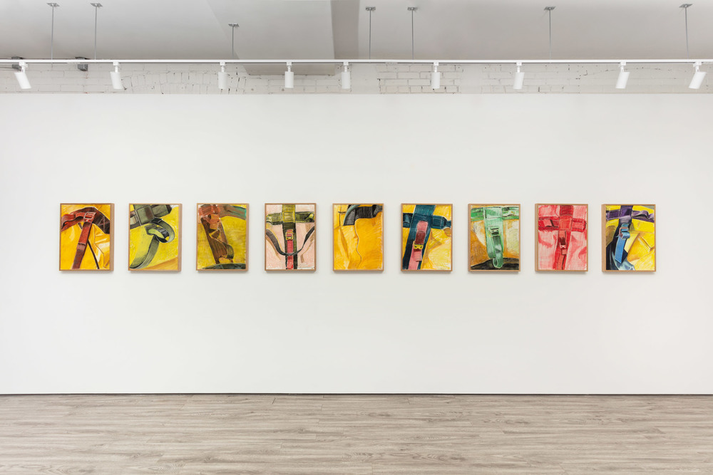
In your previous work, I’ve admired the way that you can lasso something like the Pop Secret popcorn logo or Mr. Peanut. They’re characters that you could pull into your work and have them still be these mundane commercial references, but they also become floating signifiers – they’re somehow attached but detached.
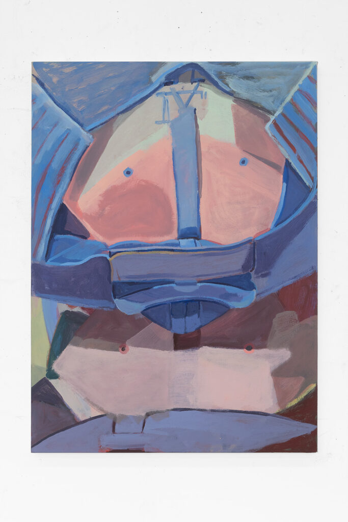
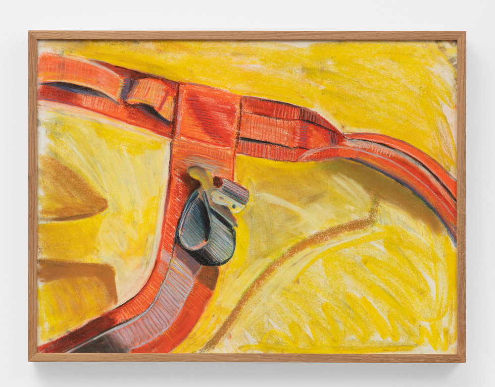
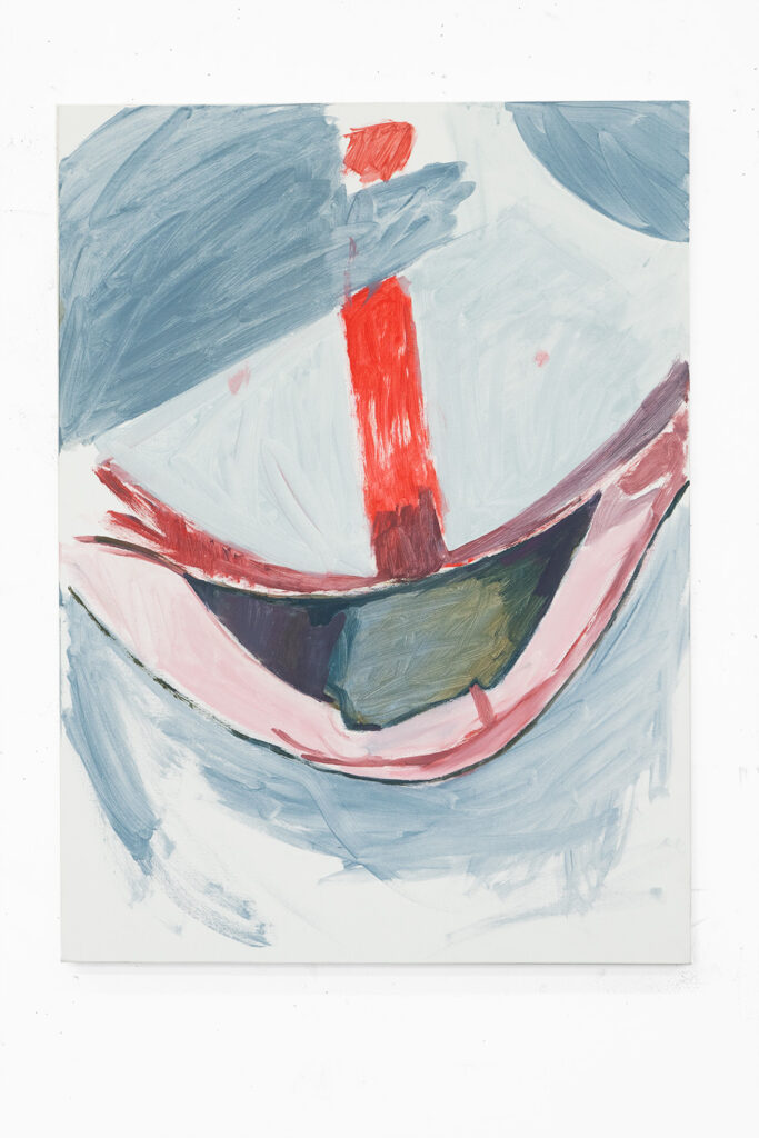
This one has the ‘LA’ on the Dodgers hat upside down and backwards and obscured by one of the seams of the hat.
JG: I usually strip away or downright ignore all the logos in the still lifes, like I did with the yellow bag drawings or the blue Pop Secret paintings. Also because it’s simply too hard to paint. I don’t want to get into that kind of detail, like words. But then for one, I was like, “Well, what will happen if I can keep this logo here?” It’s the reverse image. It’s the inside of the hat, it looks like a Roman numeral, and speaks of time.
SS: The notion of a baseball bat and the sneakers as well…you don’t have as aggressive of a reference as Pop Secret, but the Dodgers logo still shows up as hyper-recognizable. And the baseball hat itself is a contemporary object. I’m curious about the way you are able to connect this work to “Beauty and the Beast”. You’re able to have your work be earnestly tied to the big gnarly history of painting and to the material of contemporary modern life, from the ‘80s up to today.
JG: Yeah, where does that come from? You have the everyday and the overlooked that are also engineered to be maximally visible. They’re also such wide-reaching items – everybody’s got them.
SS: Well, maybe I can ask you about work being funny. There’s something about seeing the LA Dodgers logo or Pop Secret. You walk in the room, and you laugh because it’s so unexpected to see Pop Secret in this context.
JG: Part of it is that all these objects are blunt. The way I apply the paint is…some call it “aggressive,” but it’s direct. Humor is such an important tool. It can be subversive, but can also bring people into a shared reality. I feel, increasingly, like it’s not okay to be funny because everything is so serious, and for good reasons. Laughter robs pain of its power. Humor is the only thing, I think, that can collapse that or be a thing of resistance.
Maybe also along the lines of having humor in the work is something I heard from another artist I love, Monika Baer, about the idea of being a skeptical painter. Of the painting process she said, “The higher the skepticism I have, the more I expect. The more I expect, the less I can be satisfied. This scale of desire and disappointment.”
Telling a good joke and a good painting for me is an exercise of seduction and requires tension. The best kind of humor can also be so unexpected. It creeps up on you and people can laugh and then they can say, “Well, wait a minute, I don’t find that funny.” It can hit you in a way where you automatically laugh. Then they’re like, “This isn’t funny,” but too late, they laughed. It’s visceral. You can’t explain a joke because then it’s not a joke anymore.
The title I chose for the exhibition is a ready-made, just like these objects. It’s “All day I dream about sex. Sometimes after dinner, I dream again.” It’s believed by people from my generation that Adidas stands for the anagram for “All day I dream about sex.” Then the reverse is, “Sometimes after dinner, I dream again.”
It’s like, “Okay, all day you dream about sex, and then you just stop for a moment to eat. Then once you’re satiated, you dream again, but you don’t know what “I” am dreaming of.” It speaks of the process of painting, of this cycle or a trance as I was saying before. These objects are also trance-like out in the world. You can see a Pop Secret box – the design is such wonderful marketing. It’s like, “I want that.” So, these scales of desire; a cycle of addiction. Like, “You’re dreaming about sex all day? Shouldn’t you do that at night?”
SS: It is funny. Yeah, Adidas and just thinking about advertising in general. Adidas was such an object of desire for me growing up. When you talk about the association of this phrase for young people in the ’90s, “All day I dream about sex,” it’s about having track pants. Then, the adult version is “Oh wait, no, it is just about sex.”
In the full phrase you’re using as the title, there’s also this transition from the act of dreaming to, maybe, the actual act of sex or masturbation. “All day I dream about it but then after dinner is the time for action” or something. In the phrase, it goes from an idea to an action. Then in this question, are you dreaming or enacting, et cetera, somehow it comes back to these Adidas baseball hats being an object of desire.
JG: Then it’s like, “Do you really want to have sex right after dinner?” I’m already sooo full. So then you just fall asleep and dream, have your dream, then repeat [the cycle] every day. A practice of painting as a way of digesting the world…then also actual digestion. Once you metabolize, there’s a primordial output.
[Long pause]
SS: How do you know when the paintings are finished?
JG: When they become independent. How do you know when something becomes independent? I don’t know. I realize paintings aren’t finished until there’s a pair or multiples. The big yellow paintings, for example, there is the singular button or head or round shape, then in the painting that came after it, a pink strap slipped out of the next still life setup, “What else can come in to activate it? What comes before and what comes after?” Okay, there are two buttons. And also something licking on it or waving at it or just looking at it. Then I guess there’s going to be a third. Then what happens after that?
Because I don’t depict these objects in the environment of the studio, I think I do away with the figure-ground relationship that plagues us painters. But then eventually, through working on the painting, a figure does appear and a ground is established. That’s when it’s done. I’m thinking of the painting as a part-object in psychoanalysis. Melanie Klein talks about how the breast is this part-object that no longer belongs to the mother, but it’s like its own thing. “[The breast] gives me great things – food, pleasure, or whatever – but then it’s also taken away and I hate it.” I guess maybe where all this fetishy imagery comes up is like, “Well, isn’t it bad to fetishize some singular part of somebody’s body?” But then I don’t know. I like it nonetheless; I like to be desired in that way, but then not only in that way. Then painting also becomes that – we fetishize painting.
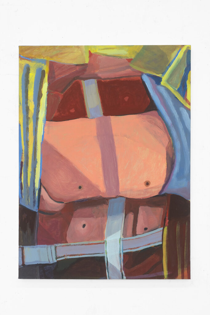
SS: So…these are tits?
JG: Bingo.
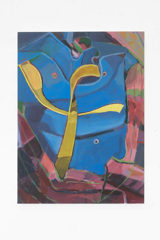
SS: Then in the exhibition, you’ll see part of the tits through a peephole at first? These tits are five-feet tall?
JG: This painting is exactly five-feet tall. You’ll see only the blue center band, the ‘figure,’ through a doorway until you enter this second room and be able to see the entire painting. There is this Trompe l’oeil effect of the strap coming out toward us.
We talk about doubt in painting. Doubt has an etymology in doubling. In this new body of work, I noticed that the composition is so center-focused, or a double – two paintings for the price of one! – where the sliver of touch or distance is a center itself. The idea of any fixed center is an illusion.
A friend and teacher of mine, Josephine Halvorson, works from direct observation and uses Trompe l’oeil in her incredible paintings. In a review of Josephine’s work, I read that in the Baroque Trompe l’oeil, the opposite of good isn’t evil; the opposite of good is doubt.
SS: Oh, like doubt is now necessary to be able to apprehend the truth?
I’m thinking about the Caravaggio painting that so explicitly illustrates Thomas sticking his finger into the wound of Christ and the grotesqueness of the shallow depth of that wound, you can see for yourself how far in the finger goes. This notion of Doubting Thomas, that doubt is a barrier to the positive idea of belief. Whereas as you say now we live in this culture where doubt is necessary or functional.
JG: Yeah, or fruitful. It’s no longer deceptive, which causes confusion.
SS: It’s funny how there’s something almost inverted in thinking about a Doubting Thomas in this painting, where it’s like the strap of the hat is probing the viewer. The sort of Trompe L’oeil maneuver – as is often the case for that genre – is coming at you. But subtly…trying to stick something in you.
JG: In that way, you and I are on the inside. The parts become a Pee-Wee’s Playhouse-type thing. Activated. If you can yank it, it will happen.
SS: There’s an invitation or a suggestion of interaction or something.
JG: Yeah.
SS: People talk about paintings having “movement,” which has always been perplexing to me – it has to do with composition, but as a word it never seems to stick to the thing I’m looking at. In this Pee-Wee’s Playhouse way it’s a kind of movement I can anticipate: “If I touch this or grab that, this will happen.” A projection of literal movement…there’s something about that kind of imagined movement in this spot where the painting is extending toward me.
JG: Or speaks of potential energy.
SS: It’s also hilarious having this moment of trompe l’oeil with the strap of the baseball hat reaching out toward you in the middle of the painting between these two baseball hats/boobs in bondage straps. Rather than the expected maneuver of the body projecting or feeling dimensional, there’s this tab thing coming out at you.
What about “The Brave Little Toaster?”
JG: It’s a disturbing children’s movie where these overused household appliances make a quest to return to their original family who have replaced them with newer appliances. The toaster, lamp, and radio want to go back so that they can be used and also be of use – to be loved. They run into problems along the way, like that air conditioner who blows himself up.
SS: There’s also that movie “Homeward Bound” about the dog that gets lost or left behind and makes a journey back to its owners.
JG: Michael J. Fox, yeah.
SS: The family is like, “Hooray, our dog that we love.” So, “Brave Little Toaster” is like the same basic plot played out with inanimate objects?
JG: Yes, a few layers removed.
SS: It’s a beautiful idea that all our crap loves being in our service and misses us while we leave the house. [Laughing] Wait, what does this have to do with these paintings?
JG: Possession and feeling possessed by possessions. The paradox of love and painting!
SS: Well, it does feel like there’s another layer of a joke or paradox, when this baseball hat that’s been worn a ton becomes the undeniable subject of this, the most serious of artforms.
You’ve been moving through the last several years with the drawings of the duffel bag, then the painting of the boxes, and now the hats and shoes. Where’s that bag now?
JG: I use it.
SS: Does it take on an elevated status having been your muse? Does the hat take on an elevated status? Can the hat eventually go to the thrift store?
JG: Well, I don’t think anyone would want it because it’s filled to the brim with a crystallized sweat. It’s like, you don’t take underwear to the thrift store.
SS: That’s true.
JG: I’ll still use it when I do really sweaty things; it’s no longer for fashion. But being the subject of a whole body of work doesn’t turn it into, like, an exalted object or artifact. It just goes back on the shelf where it came from.
Jenny Gagalka (b. 1984 Vancouver, Canada) lives in Los Angeles, USA. She received an MFA in Painting & Drawing from UCLA in 2018. She has attended residencies at the Skowhegan School of Painting and Sculpture, Ox-Bow in Michigan, and The Mountain School of Art in Los Angeles. Previous solo exhibitions include Paul Soto, Los Angeles, Towards Gallery, Toronto; Good Weather Gallery, Little Rock, Arkansas; and group exhibitions at Human Resources, Los Angeles; and Páramo, Guadalajara; among others.
Sarah Sarchin is a painter living in Los Angeles. Recent solo exhibitions include Veronica Project Space in Seattle, Grice Bench and Sean’s Room, both in Los Angeles, and the Chan Gallery at Pomona College. She received her MFA from the University of California, Los Angeles, and her BA from the University of Washington.
Leave a Reply